Placeit.net image
How can software marketers make screenshot images look more interesting? I have found a new tool that I just love that guarantees I never need to use a boring screenshot again.
Check out www.placeit.net
Basically you can upload any screenshot/image you have and it will appear as if it is on the screen in the image. You can filter by photos of laptops, tablets, phones etc… (I will say that they are very heavy on the Mac computers, which is harder for us Microsoft partners.)
It is hard to explain so let me show you an example of how it works:
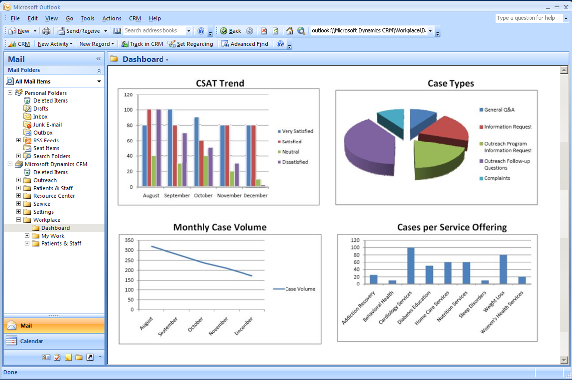
Before - Original Screenshot
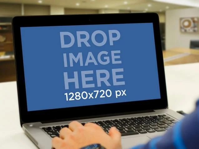
Upload to a Placeit.net screen
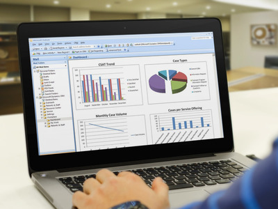
After – Improved Screenshot
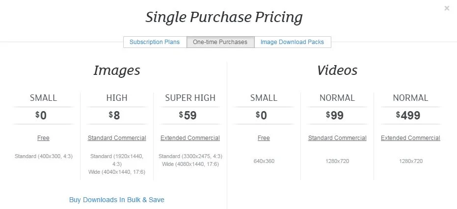
The best part is that to download a small image is FREE. And then if you want wider use you can pay per image or save money with a subscription pack. When you click Download you are given size options along with a link to "Not sure which version is right for you?" guidelines. (Make sure if you use the free version that you are following the rules.)
There is also an FAQ and Pricing link at the footer of the page.
I wish I could give you the links to these pages but I can’t because they appear to be iframes within the site without unique URLs, which is a bit frustrating. And there is honestly not too much in terms of instructions on the website. You just have to dive in and try it for yourself at www.placeit.net .
Hint: If you follow them on Twitter @placeitapp they periodically send out coupon codes for subscriptions.
I have already seen two Dynamics partners that I can tell have used this tool. Check out the creative images used in these blog posts:
http://www.socius1.com/let-your-business-processes-flow-with-dynamics-crm-2015/ and
Try it! Your screenshots will never be the same again.
By Anya Ciecierski, www.cwmktg.com
